Quick Check
- Discover hidden WordPress layout controls to transform chaotic designs into professional sites.
- Learn counterintuitive tricks for managing widths, borders, and responsive settings with ease.
- Master the Customizer to balance spacing and ensure your site looks flawless on all devices.
The Hook
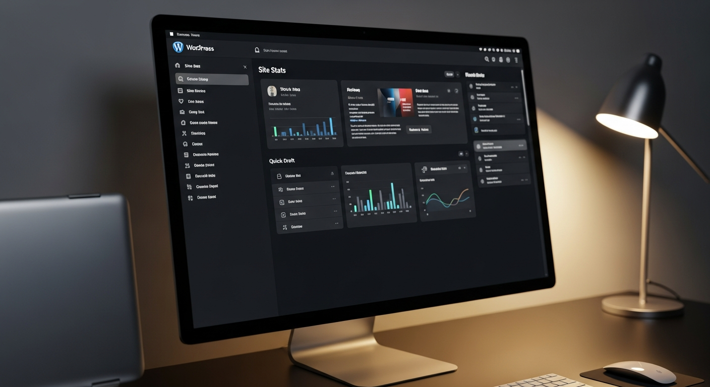
Ever stared at a WordPress dashboard and thought, “What the hell did I just get myself into?” Yeah, me too. Yesterday, I was this close to rage-quitting. But then—click!—the fundamentals snapped into place. If you’re diving into WordPress for the first time, buckle up. This isn’t your grandma’s tutorial. We’re talking no-BS, hands-on, make-your-site-look-like-it-costs-a-million-bucks guidance. And trust me, if I survived Hildexa.com’s German chaos, so can you.
The Review/Process
Mastering the Layout Maze
First things first—let’s tackle the layout. WordPress might pretend to be user-friendly, but beneath that polished exterior lies a labyrinth of margins, paddings, and borders that could drive even the sanest person mad. Case in point: my homepage header. It looked like a drunk designer threw up on it—placeholder text everywhere, borders wider than my ego, and zero cohesion.
Step 1: The Hidden Panel Revelation
After hours of futile tweaking, I stumbled upon this game-changer—the top-left panel. It’s like WordPress’s secret handshake. Click those groups, and boom—you’re in layout control central. But beware: WordPress loves to play tricks. For instance, the “restore” feature refused to behave. It kept spilling outside my defined boundaries like a rebellious teenager. Why? Because WordPress defaults to a whopping 1400px width, which is absurd unless you’re designing for a 4K IMAX screen.
Step 2: Taming the Width Beast
Here’s where things get counterintuitive. You’d think toggling “full width” would give you, well, full width. Nope. It’s a mind game. You need to leave the width field empty and keep that toggle on. Do it, and watch as your borders snap into a perfect, 1400px-wide alignment. It’s like magic—if magic involved wrestling with software bugs.
Step 3: Border Bliss (or Not)
With the layout stable, it was time to fine-tune the borders. Standard industry practice is 1200px, but WordPress insists on 1400px. Why? Who knows. I dialed it back to a sleek 800px, but that squished everything like a clown car. The sweet spot? Zero. That’s right—no borders. Just pure, unadulterated content flow. It’s minimalist, it’s modern, and it’s finally starting to look like a professional website.
Customizer Chaos: Where Creativity Meets Confusion
Next stop: the Customizer. This is where you can unleash your inner designer—or accidentally turn your site into a digital circus. I started by adjusting the overall width to 1200px, which gave the content room to breathe without feeling cramped. Then, I tackled the margins between text blocks. WordPress offers a “spacing” option, but it’s as vague as a horoscope. I cranked it up to 2, which struck a balance between cramped and cavernous.
Step 4: Mobile Madness
Responsive design is non-negotiable. I previewed the site on mobile, and it was a disaster—text overlapping images, margins wider than the Grand Canyon. A few quick tweaks in the Customizer—reducing the mobile margin to “small”—and voila! The site looked polished on any device. It’s like having a chameleon website that adapts to its surroundings.